Plot the variable importance as a bar plot.
Value
A ggplot object.
Examples
# Acquire environmental variables
files <- list.files(path = file.path(system.file(package = "dismo"), "ex"),
pattern = "grd",
full.names = TRUE)
predictors <- terra::rast(files)
# Prepare presence and background locations
p_coords <- virtualSp$presence
bg_coords <- virtualSp$background
# Create SWD object
data <- prepareSWD(species = "Virtual species",
p = p_coords,
a = bg_coords,
env = predictors,
categorical = "biome")
#> ℹ Extracting predictor information for presence locations
#> ✔ Extracting predictor information for presence locations [20ms]
#>
#> ℹ Extracting predictor information for absence/background locations
#> ✔ Extracting predictor information for absence/background locations [46ms]
#>
# Train a model
model <- train(method = "Maxnet",
data = data,
fc = "l")
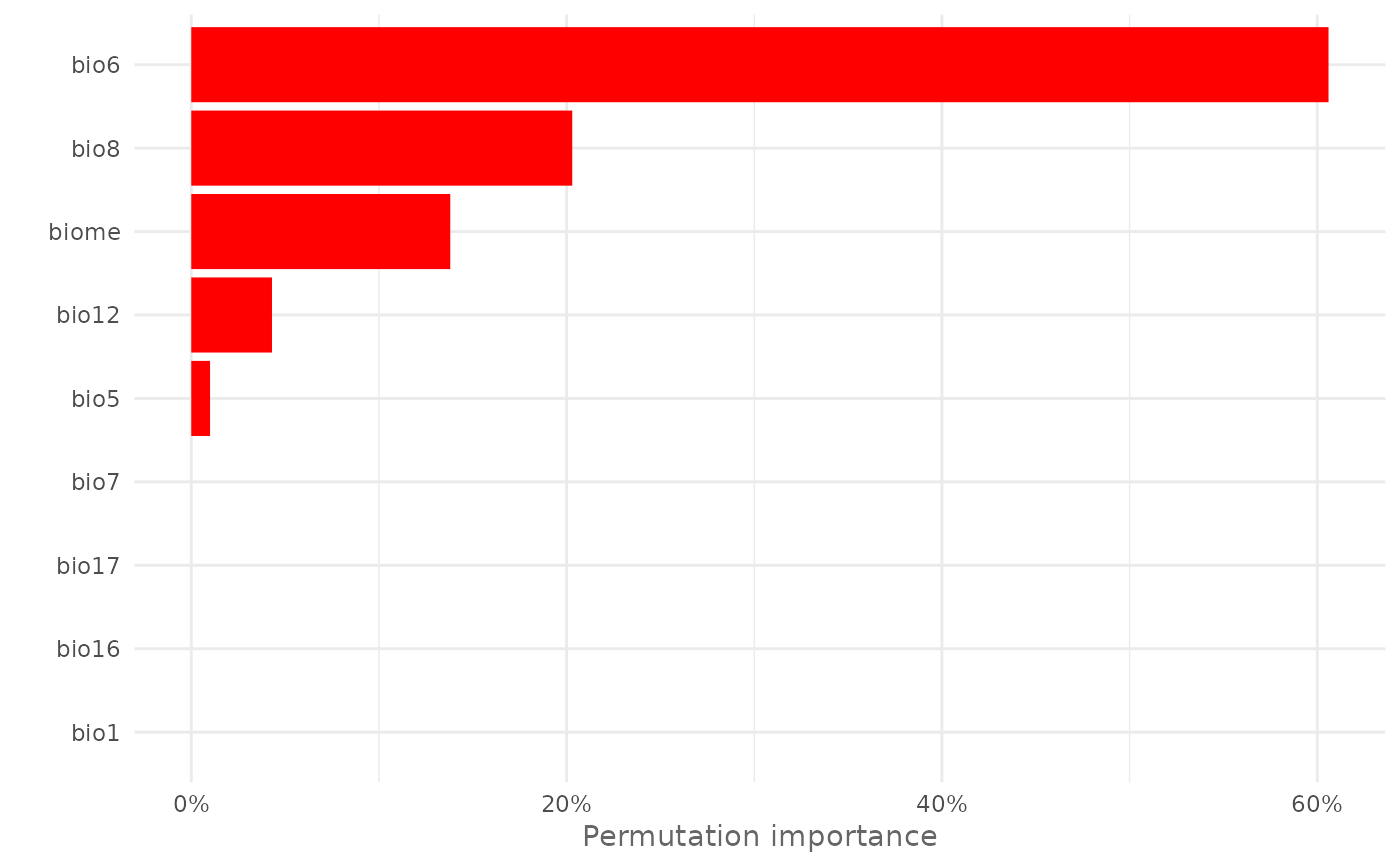
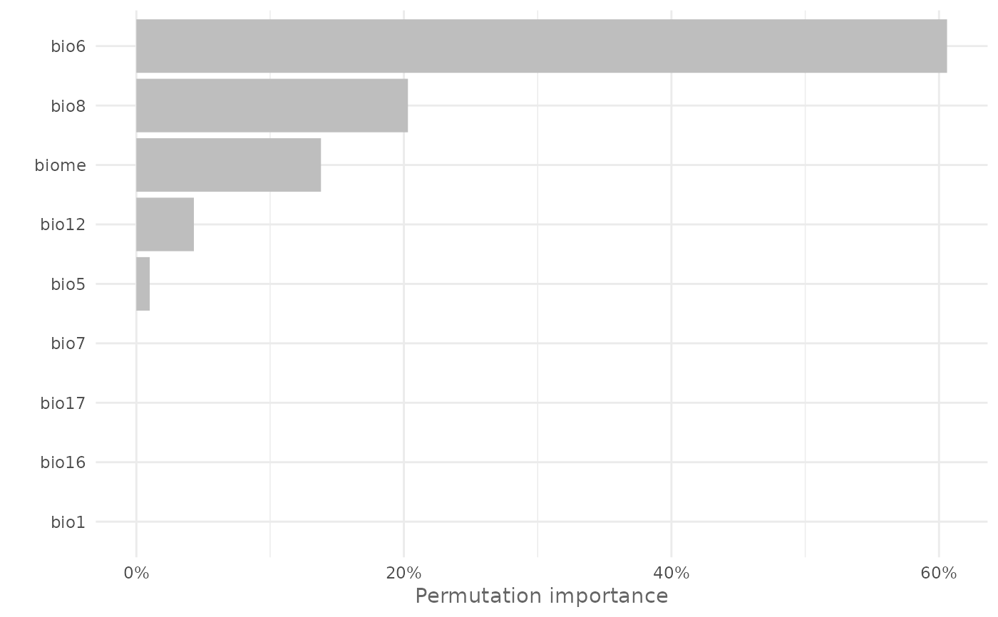
# Compute variable importance
vi <- varImp(model,
permut = 1)
# Plot variable importance
plotVarImp(vi)
 # Plot variable importance with custom color
plotVarImp(vi,
color = "red")
# Plot variable importance with custom color
plotVarImp(vi,
color = "red")